
Font Selector | Fabrie Write(AI)

Font selector
for Fabrie
Product design: Muki, Chichi
UX design: Muki
UI design:Yoda
Front End develope: Guopeng
Quality assurance: Xiaoyang
01
Framing
Why fabrie need a Font Selector?
In situations where layout and typography are crucial, such as during initial inspiration exploration with mood boards or while creating slides and project proposals, a single default font may not suffice. More diverse fonts are needed to present designs more accurately and clearly.

Creating moodboard on fabrie

Creating slides on fabrie
02
Discovering
How is a Normal Font Selector Look Like?
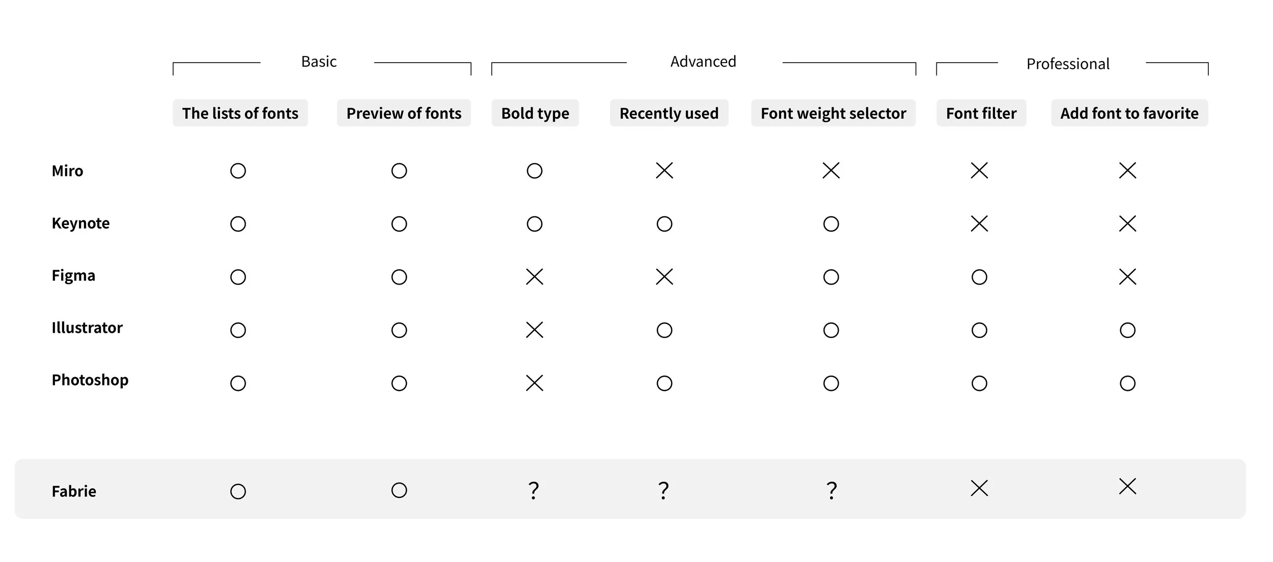
After researching design tools such as Miro, Keynote, Figma, Illustrator and Photoshop. I catogorize features of the font selector into three type: Basic, Advanced and Professional.
Basic features is usually a must for a font selector, while advanced and professional features depends on their user scenarios.
In online whiteboard, such as miro, users typically cannot modify font weights and are only provided with a bold option. Professional design software such as Photoshop, Illustrator, and Figma offer font weight options and even more complex typography features.
How would the Font Selector Look Like in Fabrie?
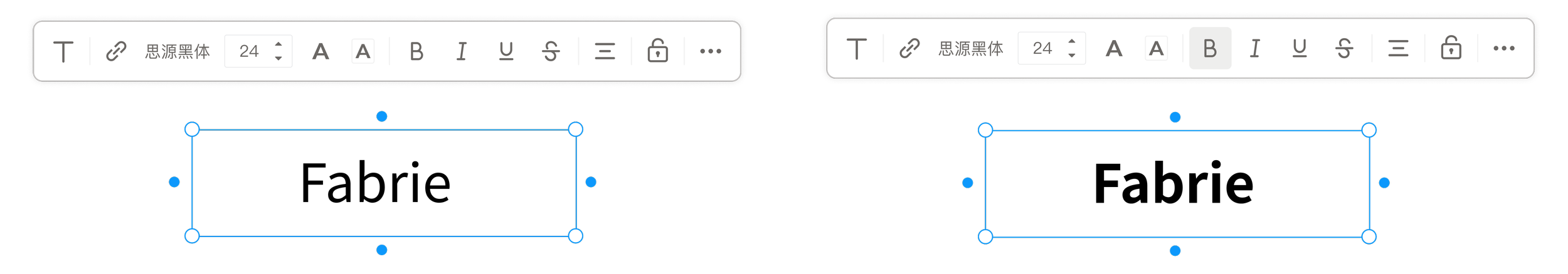
Fabrie’s situation lies between the two. Professional features is too complex for fabrie, while here comes the question: Should bold type, recently used and font weight seletor be provided in fabrie? The core issue depend on the “ font weight selector”.
Benifits of having a font weight selector
Providing richer typography styles
Increasing a significant flexibility of design
However, disadvantages are also critical:
Increased Complexity: Adding font weight options complicates the font editing functionality. Although our target users are designers, not all designers across different industries have a foundation in visual design, and not everyone may understand the implications of font weight.
Complexity of Bold Function: With the introduction of font weight options, the existing bold function becomes particularly complex.
Performance Impact: Providing font weights requires loading additional font packages, which can lead to performance degradation.
Dicision
Therefore, we have chosen 1) offer bold type 2) not to offer font weight selector 3) offer recently used to blance between usable and complexity.
To solve the problem of limited typography styles, we decide to offer a rich set of default fonts. Specifically, when designing the font list, some fonts use their light or bold versions as the default "Normal" value for users, resulting in a rich variety of font styles.
While “Recently used” is both a user and technically friendly feature so we provide it without hesitation.
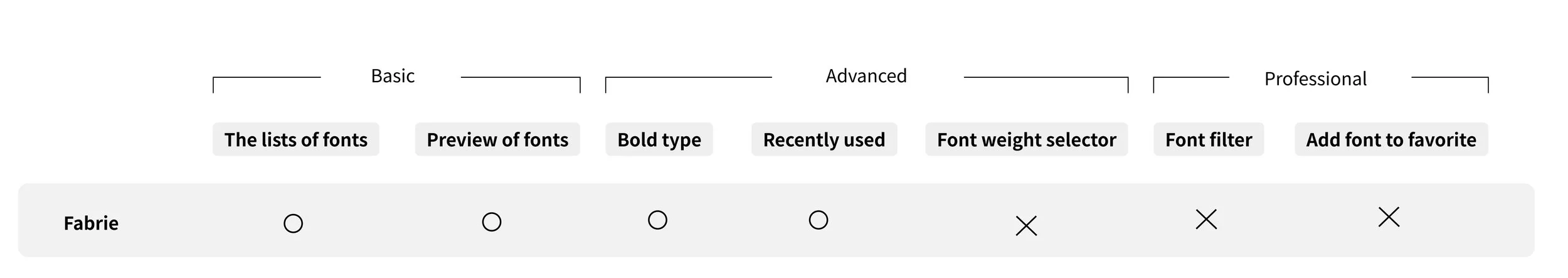
03
Iterating
How Many Fonts Should Be Provided for Users to Choose From?
As an online whiteboard rather than a professional design tool, providing users with too many choices can actually be confusing. It is sufficient to offer a number of fonts that cover most styles and scenarios.
Fabrie is a web-based online whiteboard tool and cannot access users' local fonts. When rendering fonts on the whiteboard, it is necessary to load fonts that are not already in the cache. To reduce user wait times and technical strain, it is also advisable to limit the number of fonts.
Ultimately, we have decided that the Fabrie.cn domestic site will offer 10 Chinese fonts and 10 Western fonts, while the Fabrie.com international site will offer 20 Western fonts. We believe this is the minimum number that can cover all user scenarios.
What Standards Should Be Used to
Choose Fonts?
Taking the font selection for the Chinese site (fabrie.cn) as an example, the standards are as follows:
Coverage of All Scenarios: The selected font combination should cover all scenarios including headings, body text, and decorative text.
Comprehensive Character Set: At least two to three of the fonts should have a sufficiently large character set.
Commonly Used Fonts: The fonts should be commonly used by users, avoiding unconventional choices.
Free of Copyright Issues: The fonts should be free from copyright disputes and available under a license that avoids legal issues.
High Quality: The fonts themselves should be of high quality.
Includes Default and Brand Fonts: The combination should include both default fonts and any specific brand fonts.
Font list

Flow diagram & Prototype

04
Reflecting
After the feature was released, we found that the usage of the fonts is very balanced, which indicates that the font selection works well and users are actively engaging with it.
05
After stories
In Fabrie, the default font issue consists of two parts: the default font for the UI interface and the default font for text input boxes on the whiteboard. We have encountered difficulties with both types of default fonts.
Trouble of UI Default Font
During internationalization of the product, we selected TT Interface as the brand font. We considered changing the Fabrie.com font to TT Interface. However, we found that TT Interface did not align well with surrounding icons.
We later discovered that this was due to TT Interface’s font baseline being significantly higher than that of Chinese fonts. To resolve this, we used FontLab to modify the TT Interface font file, adjusting it based on the Pingfang baseline.
Trouble of Input Box Default Font
In the early stages of product design, we initially used system default fonts, namely Pingfang (Mac) and Microsoft YaHei (Windows), as the default fonts.
Because these are two different fonts with varying parameters such as character width and default spacing, Microsoft YaHei typically wraps text earlier and takes up more space than Pingfang. On the UI interface, responsive design prevents major issues despite font differences.
However, on the whiteboard, such flexible handling is not available. Users can input text into text boxes, sticky notes, and basic shapes, where the size of the shapes is determined by the fixed values of the user-resized bounding box. This means that when viewing the same document on different systems, the content layout may change due to font differences.
Since the company's computers are all Mac systems, we discovered this issue late. We had to retroactively switch the default font to a cross-platform font, Source Han Sans. However, because user documents already contained old data in Microsoft YaHei or Pingfang, changing to the new font would also lead to layout issues. Therefore, we had to retain these three fonts. On the UI interface, the original Pingfang and Microsoft YaHei will display as "System Font."